¿Porqué Python y Jupyter?
- Gratis y open source
- Versátil y completo: "Baterías incluidas"
- Gran comunidad
- Retroalimentación inmediata
- Perfecto para hacer ciencia
Proyectos
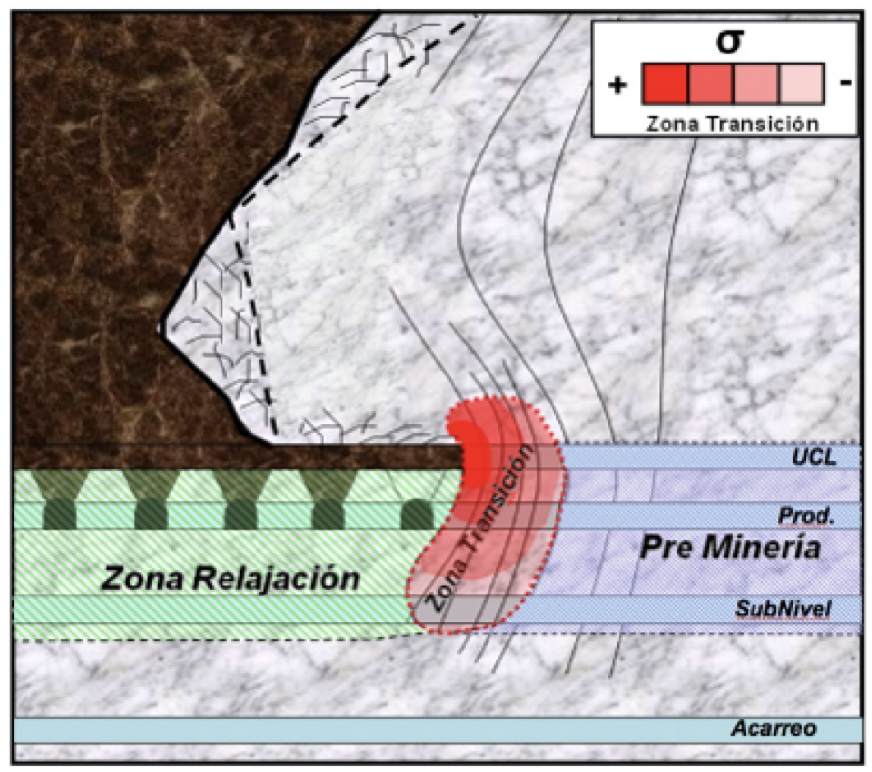
En minería subterránea: 2008 a 2010 - Análisis de Block Caving 2012 a 2013 - Microsismicidad Usamos Python para implementar ecuaciones de mecánica de sólidos, de fluídos y de ruptura, y para resolver el problema inverso de conocer el estado del macizo rocoso a partir de eventos microsísmicos.
Proyectos

2014 a 2015 - Propagación de tsunamis
Usamos Python para:
* Preprocesamiento: codificar conjunto de pruebas de soluciones conocidas.
* Procesamiento: Implementación numérica de Shallow Water Equations, usando volúmenes finitos en mallas triangulares adaptativas.
* Módulo de post-procesamiento: motor gráfico para hacer animaciones.
Artículo publicado en congreso de la Sociedad Chilena de Ingeniería Hidráulica.
Proyectos
**2005 a hoy - Pypsdier**
Usamos python para implementar ecuaciones de reacción-difusión para catalizadores inmobilizados en particulas porosas.
La librería está disponible públicamente en pypi.
Numerosos congresos y publicaciones.
Algunas reflexiones
- Programación (tecnología en general) es un juego en equipo.
- Hay mucho realizado, pero hay más por hacer.
- El problema ya no es la información, sino la motivación.
Ejemplo 1
Código realmente interactivo.
La programación, en particular Python, te permite comprender un fenómeno de manera intuitiva e interactiva.
El "pensamiento computacional" es una habilidad a desarrollar.
In [ ]:
import numpy as np
import matplotlib.pyplot as plt
from math import pi

def plot_graph(a=1.0, b=0.5, theta=2*pi):
    # some arbitrary function of a,b,c
    x = np.linspace(-10,10,1000)
    y = a*np.sin(theta*x) + b*x
    plt.plot(x,y)
    plt.ylim(-10,10)
    plt.title("y = $A \ \\sin( \\theta x ) + B \ x$")
    plt.show()
In [ ]:
plot_graph()
In [ ]:
from ipywidgets import interact
interact(plot_graph);
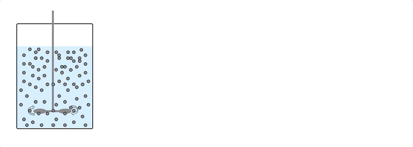
Ejemplo 2: Pypsdier
Desarrollando para un usuario sin mucha experiencia: mi experiencia con pypsdier.
Primer paso: Instalar la librería
In [ ]:
#!pip install pypsdier --upgrade
!pip install git+https://github.com/sebastiandres/pypsdier.git --upgrade
Definiendo los parámetros de la simulación
In [ ]:
def MichaelisMenten(S, E0, k, K):
"""Definition for Michaelis Menten reaction with inputs E0 [mM], k [1/s] and K [mM]"""
return (-k*E0*S[0]/(K+S[0]), )
inputs = {}
inputs["SimulationTime"] = 60. # [s]
inputs["SavingTimeStep"] = 1. # [s]
inputs["CatalystVolume"] = 0.5 # [mL]
inputs["BulkVolume"] = 100.0 # [mL]
inputs["Names"] = ('Substrat',) # legend for the xls, reports and plots
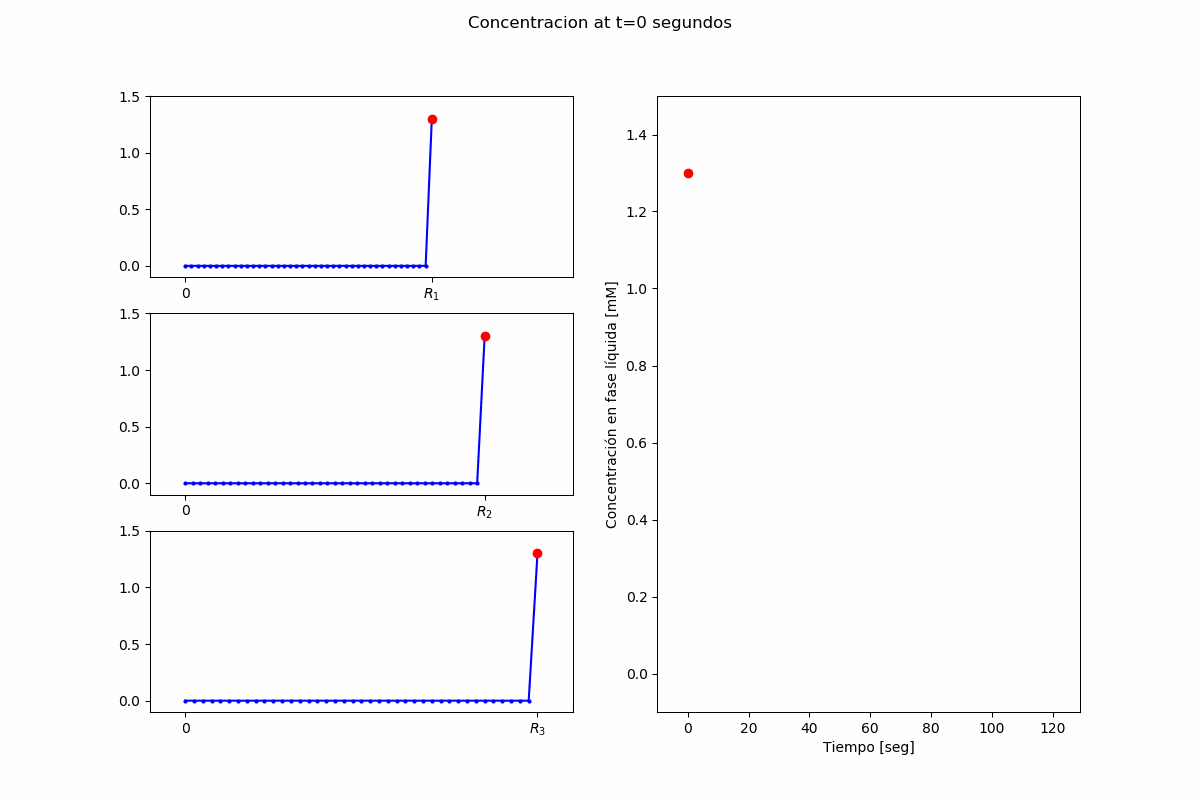
inputs["InitialConcentrations"] = (1.3,) # [mM]
inputs["EffectiveDiffusionCoefficients"] = (5.3E-10,) # [m2/s]
inputs["CatalystParticleRadius"] = [40.0E-6, 60.0E-6, 80.0E-6] # [m]
inputs["CatalystParticleRadiusFrequency"] = [0.3, 0.5, 0.2] # []
inputs["ReactionFunction"] = MichaelisMenten # function
inputs["ReactionParameters"] = (41 , 0.13) # [1/s], [mM/s], parameters
inputs["CatalystEnzymeConcentration"] = 0.35 # [mM]
Definiendo los parámetros gráficos
In [ ]:
plot_options = {}
plot_options["label_x"] = "Tiempo de reacción [s]"
plot_options["label_y"] = "Concentración [mM]"
plot_options["title"] = "Simulación de Michaelis Menten"
plot_options["ode_kwargs"] = {'label':'Enzima Libre', 'color':'blue', 'marker':'', 'markersize':6, 'linestyle':'dashed', 'linewidth':2}
plot_options["pde_kwargs"] = {'label':'Enzima Inmobilizada', 'color':'blue', 'marker':'', 'markersize':6, 'linestyle':'solid', 'linewidth':2}
plot_options["data_kwargs"] = {'label':'Experimento', 'color':'green', 'marker':'s', 'markersize':8, 'linestyle':'none', 'linewidth':2}
plot_options["data_x"] = [0.0, 30, 60, 90, 120]
plot_options["data_y"] = [1.3, 0.65, 0.25, 0.10, 0.0]
Lanzando una simulación, extremadamente simplista:
In [ ]:
import pypsdier
SIM1 = pypsdier.SimulationInterface()
SIM1.new(inputs, plot_options)
SIM1.simulate("ode")
SIM1.simulate("pde")
Veamos el resultado
In [ ]:
SIM1.plot(figsize=(14,10))